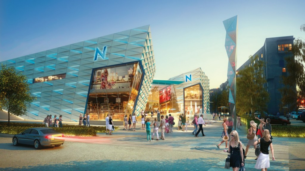
Harbour placed shopping mall Nautica has got a new name and a new look. After rebuilding the shopping mall, two wayfinding kiosks were also placed. Although the mall is not large, the wayfinding feature is really important for them.

Nautica mall in Tallinn, Estonia reopened in the end of 2017. It has only about 60 shops but wayfinding kiosks are more important than ever after the renovations. Old shops are in new places, new shops have been advertised but neither the old or new clients know where to find them.
In Nautica things are made even more difficult, because a new floor was added and most of the restaurants, ATM-s and bathrooms are placed there.
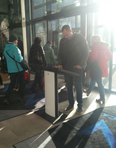
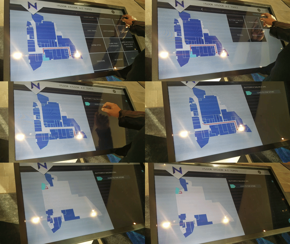
Kiosks in Nautica are simple and practical. They don’t take a lots of room and their slanted design indicates immediately that the screen – even though it might have an advertisement as a screensaver – is meant for customers to use.

Kiosks are conveniently placed by the doors of the two main entrances, these are the first things that every customer sees when they enter. Placement like this makes it easy for visitors to notice and they don’t need to start looking for maps or signs when they are not sure where they should go.
It is also practical because it’s more likely for the visitor to take notice of the kiosk right after entering than in the middle of the busy mall. So when they need to use it later, it’s easier for them to remember where to find it.

The design for the new template was provided by the mall so we only needed to bring it into reality. They wanted a stylish and simple look with clear and easy to use interface. They also wanted to have all the shop names displayed on default screensaver, slowly rolling by on the screen. This animation with shop logos also works on map view, if the customer hasn’t touched the screen for a little while.
